Mostrando entradas con la etiqueta Color. Mostrar todas las entradas

11 enero 2018

9 normas de estilo que te encantará romper!

En la moda, como en (prácticamente) todo, existen ciertas reglas. Aunque dichas reglas también pueden, y a veces deben, romperse. Rosa y rojo, azul marino y negro, rayas con cuadros... todos hemos oído alguna vez los colores o los estampados que no deben mezclarse pero, mi pregunta es, ¿y por qué noA continuación van unos cuantos looks que demuestran no solo que esas combinaciones que algunos claman imposibles, son muy posibles, si no que además algunas están más de moda que nunca y dominan el street style:

There're some rules when it comes to fashion, as it happens with (almost) everything in life. Such rules also can be (and sometimes they must be) broken. Pink and red, dark blue and black, stripes and squares... we've all heard at some point which colors or prints shouldn't be worn together but, my question is, why notHere they come some outfits which show not only that such combinations are beyond possible but also that they're trendier than ever, ruling the street style:


1. ROJO & ROSA
Los eternos enemigos. Una de las relaciones de amor-odio más extendidas por todo el planeta (rosa y rojo, puñetazo en el ojo). En realidad, son dos colores muy parecidos y que dan lugar a combinaciones muy resultonas:

1. RED & PINK
The eternal enemies. I think this is one of the most international love-hate relationships that exists. Actually, both colors are quite similar and personally, I think that they create real interesting combinations:


2. ROSA & NARANJA
Forman parte del mismo círculo cromático, una cualidad que hace que para muchos esta sea una combinación difícil de ver. Yo, particularmente, no lo encuentro la dificultad por ninguna parte. Además de dar como resultado un look muy alegre y lleno de vitalidad:

2. PINK & ORANGE
Both belong to the same chromatic circle. Some might think that this quality make both colors incompatible. I, particularly, don't find the incompatibility anywhere. Besides, the combination makes the outfit quite fun and full of vitality:


3. AZUL CELESTE & ROSA BEBÉ
Para empezar, debemos de romper con la horrible tradición de vestir a los niños de azul y a las niñas de rosa. Es machista y muy pasado de moda. Segundo, son perfectamente combinables, una unión bastante tierna:

3. LIGHT BLUE & BABY PINK
To begin with, we should break with that awful tradition of wearing boys in blue and girls in pink. It's old-fashioned and sexist. Secondly, they're very combatible and the result is very cute, actually:


4. NEGRO & MARRÓN
Dicen que el negro y el marrón es una combinación difícil. También dicen que el negro combina con todo. Yo me decanto por lo segundo. Si no te sientes muy cómod@ usando estos dos colores juntos, empieza por vestir de negro y usar accesorios en marrón. El camel también es una buena opción para empezar a usar ambos colores juntos:

4. BLACK & BROWN
Many people agree that this is a difficult combination. But, people also say that black is a color that matches with everything. I agree more with te second statement. If you don't feel comfortable wearing these two colors together, you can start by wearing all black and using brown accessories. Camel is a perfect choice to start dressing in black and brown:


5. NEGRO & AZUL MARINO
Sinceramente, no sé por qué se ha dicho siempre que estos dos colores no casan. He investigado un poco y parece que tiene una base histórica (por lo visto, en la Edad Media el negro lo vestía la clase alta y el azul el pueblo llano). Sea cual sea la razón, yo los encuentro súper compatibles. Eso sí, mi consejo es que sean colores bloque. Juzgar vosotr@s mism@s con las siguientes fotos:

5. BLACK & DARK BLUE
Honestly, I really don't know where this incompatibility comes from. I've researched a little bit and it seems to have a sort o historical basis (in the Middle Ages, the upper class used to dress in black and the lower class wore blue). Being this the real reason or not, I like how they look together. The only advice I can give you is that you use block colors. Judge yourself the pictures:


6. RAYAS & CUADROS
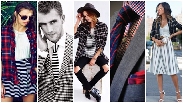
Sin duda, arriesgado, pero no imposible. Eso sí, ambos estampados tienen que estar en su justa medida. Un truco, intenta que ambos estampados compartan las mismas tonalidades (cuadros y rayos en negro y blanco suelen funcionar bastante bien). Por cierto, es aconsejable que uno de los estampados destaque más que el otro:
6. STRIPES & SQUARES
This is, with no doubt, a risky combination, but not impossible. If you wear them together, make sure you don't overdo your outfit. A trick might be that both prints share the same hues (black and white stripes and squares should work). Besides, I recommend you that one of the prints stand out upon the other:


7. DENIM TOTAL LOOK
Para mi es una tendencia que nunca pasa de moda y con la que se pueden conseguir grandes looks. Unos 501, una cazadora o una camisa vaqueras son fondo de armario. El truco para combinarlos: elige distintos tonos de denim e intenta aportar un toque de color con algún accesorio:

7. DENIM TOTAL LOOK
For me, this is a tendency which never gets old and that allows youto create amazing outfits. A pair of 501, or a denim jacket or shirt are basics that you must have in your closet. The trick to wear a denim total look: choose different denim hues and try to include a touch of color with an accessory:


8. ANIMAL PRINT TOTAL LOOK
Una combinación arriesgada pero que puede ser todo un éxito. El ser humano lleva vistiendo animal print desde que usaban las pieles de los animales que cazaban para vestirse. A lo largo de la historia, su uso ha estado ligando a distintas clases sociales (a la realeza, por ejemplo) y ha sido sinónimo de alguna corriente estética (como la punk en los 70 y 80). Atrévete a mezclar distintos tipos de animal print, o a mezclarlo con otros estampados!:

8. ANIMAL PRINT TOTAL LOOK
A very risky combination, but it can be a huge success. The human being has been wearing animal print since we used to wear the skin of the animals that we hunted. Through history, its use has been associated to different social classes (such as royalty), and it's been also the symbol of some aesthetic trend (for instance, the punk movement durint the 70s and 80s). Dare to mix different animal prints or combine it with another prints!:


9. SANDALIAS & CALCETINES
Reconozco que, personalmente, no soy muy fan de esta moda, pero no por nada en concreto. A la hora de vestir hay que tener personalidad y criterio. Esta es una combinación que no uso pero porque, sencillamente, no va con mi estilo, aunque admito que hay gente con mucho rollo y que sabe defenderla:

9. SANDALS & SOCKS
I recognize that, personally, I'm not a huge fan of this trend. I don't really have anything about it, it's just that I think that when it comes to your own style, you should have personality and be honest to your own taste. I don't wear sandals with socks 'cause, honestly, it doesn't suit me. But I do admit that there're people who kill it:


Instagramalberto.monteagudo
Twitter@A_Monteagudo

24 mayo 2016

Flamingo Parade & El Poder Del Flamingo

Flamingo Parade

Sabéis una de las cosas que más me gustan de esta marca (a parte, por supuesto, de sus gafas)? La historia que se esconde detrás de su nombre, la cual explican maravillosamente bien en su página web. Pero tranqui, que te ahorro el trabajo de buscarla y sólo tienes que hacer click AQUÍ!

Pero volvamos a lo importante: Flamingo Parade. El nacimiento de esta marca viene de la mano de @_withcon_. Es abogada y estudió Dirección de Empresas de Moda nada más y nada menos que en Milán, y además fue fashion blogger mucho antes de que esto se pusiera de moda. Hace cosa de un año, comenzó a rondar por su cabeza la idea de crear esta marca y fue hace unos 8 meses cuando comenzó a hacerse realidad. ¿Por qué gafas? Bueno, primero porque le apasionan y su colección es interminable. Y segundo, porque es de Alicante, y otra cosa no, pero allí gafas de sol hacen falta casi todo el año.

Flamingo Parade

Empezaron lanzando el modelo MUST, que es el que veis en las fotos. En concreto, el que llevamos es el MUST PINK, a qué mola? Optaron por usar madera porque, a parte de la originalidad del material, es súper ligero. Como dato curioso, las MUST están hechas de madera de haya. Sabéis cuánto pesan? Sólo 22 gramos!! También trabajan con ébano, bambú o skate, y todas están hechas totalmente a mano y de forma artesanal.

Ya sé que estáis pensando que, a día de hoy, habéis visto muchas marcas con gafas de sol hechas de madera, pero otra de las cosas que hacen a Flamingo Parade tan especial son sus precios súper competitivos. Sus gafas de madera no superan los 45 euros, cuando muchas otras marcas no bajan de los 100, usando los mismos materiales y con el mismo acabado.

Flamingo Parade | MUST PINK
Photo: Ismael Álvarez

A pesar de empezar como una marca de gafas de sol de madera, también están trabajando en nuevos modelos hechos de acetato. Y, como buenos apasionados de la moda, no descartan la idea de lanzar nuevos accesorios en un futuro no muy lejano. Aunque su único punto de venta físico está actualmente en Murcia, podéis hacer vuestra compra por Internet sin ningún problema, y en 48 horas tenéis vuestras Flamingo Parade en casa.

Si quieres tus gafas Flamingo Parade para este verano (o para cualquier temporada del año), utiliza el código descuento RIDE20 al hacer tu compra y consigue tus gafas por un 20% menos!! Y recordad que podéis seguirlos y estar al tanto de todas sus novedades en su página de Facebook y también en su cuenta de Twitter e Instagram ;)

Flamingo Parade | MUST PINK
Photo: Alberto Monteagudo


Do you want to know one of the things that I like the most about this brand (apart, of course, from their glasses)? The story behind its name is amazing, and they explain it really wonderfully in their website. But don't worry, you won't have to look for at as I provide you the link just clicking HERE

But let's go back to what's really important: Flamingo Parade. This Spanish brand was born thanks to @_withcon_. She's a lawer and she also studied Fashion Business Management in Milan. Besides, she was a fashion blogger much earlier than it became popular. About one year ago, the idea of creating the brand started appearing in her head and it was 8 months ago when it began to become a reality. Why glasses? Well, first of all she loves them and her collection is endless. Secondly, because they're from Alicante, and trust me, if there's something that they need there, that is sun glasses.


Flamingo Parade | MUST PINK
Photo: Ismael Álvarez

They started by launching the MUST design, which is the one that you can see in the pictures. To be more precise, the one we're wearing is called MUST PINK, isn't it cool? They decided to use wood because, apart from being an original material, it's really light. As a curiosity, the MUST designed is made out of beech. Can you guess its weight? Just 22 grammes!! They also work with ebony, bamboo or skate, and all of them are handmade.

I know that you might be thinking that you've already seen a lot of brand with sun glasses made out of wood. Though, one of the things that make Flamingo Parade so special too is that its prices are really competitive. Their wooden glasses do not cost more than 45 euros, when many other brands sell them over 100€, using the same materials and whit the same result.

Flamingo Parade | MUST PINK
Photo: Ismael Álvarez


Although they've started as a wooden sun glasses brand, they're also working in new designs made of acetate. Besides, as fashion is their passion, they're ar considering the idea of launching new accessories in the near future. Though at the moment they just have one physical selling point in Murcia, you can buy online with no problem, and you'll have your Flamingo Parade glasses at home in less than 48 hours.

If you want your Flamingo Parade glasses for this summer (or for any other season of the year), use the code RIDE20 when purchasing your glasses and you'll obtain a 20% discount!! Remember that you can also follow them and all their news on FacebookTwitter and Instagram ;)

30 diciembre 2014

Get ready for the last night of the year!


Fin de año está a la vuelta de la esquina (como que es mañana!) Sí, ya ha pasado otro año.... Y entre tanta comida/merienda/cena familiar típica de estas fechas, toca hacer balance y plantearse nuevos propósitos para el 2015, y quien dice nuevos, dice los mismos de siempre, esos que nunca se acaban cumpliendo: ponerse a dieta, aprender idiomas, hacer más ejercicio... que os voy a decir que no sepáis!

Dejando todo esto a un lado, también toca elegir modelito para despedir el 2014 y darle la bienvenida al nuevo año. Si hace 365 días os dejaba un post con algunas propuestas para ir requeteguapos por fuera, ahora os traigo otro pero para ir requeteguapos por dentro.

De todos es sabido que, aparentemente, da suerte empezar el año con ropa interior roja. Yo no sé si eso será cierto, pero por intentarlo que no quede, no? Me he documentado (sí, lo sé, estoy que me salgo) y algunos de los significados del color ROJO son el poder, la vitalidad y la ambición, además de aportar coraje, confianza y optimismo, por no hablar de que es el color por excelencia del amor, el deseo y la pasión. Aunque no creáis en estas cosas da igual, porque de todas formas es un color bien bonito! Así que aquí os dejo algunas propuestas por si aún no estáis equipados:


FELIZ AÑO NUEVO A TOD@S!!

______________________________


New Year's Eve is just around the corner (actually, it's tomorrow!) Another year is about to finish.... and within so many family meals and suppers so typical of this time of the year, we have to look back and make some new resolutions for 2015. Well... they don't have to be that new, we can always call upon those resolutions we never fulfil: get on a diet, learn another language, work out... well, nothing new you don't know yet!

Leaving all of that aside, we also have to choose a proper outfit to say farewell to 2014 and welcome the new year. If 365 days ago I wrote a post with some ideas to look magnificent on the outside, now I want you to look magnfiicent on the inside as well.


It is well known that, apparently, starting a new year with red underwear brings luck. I don't know if that's true or not, but there's nothing wrong with trying it, right? I've made some research (yes, I know, I'm surprised with myself too) and some of the meanings associated to the colour RED are power, vitality and ambition; it also gives courage, self-confidence and optimism, and it's also the colour of love, desire and passion. It doesn't matter if you don't believe in that stuff, because it's a really nice colour in any case! So here you have some proposals just in case you still don't have the entire equipment.


HAPPY NEW YEAR'S EVE!!

21 enero 2014

Costa Brava Blue


Hace un par de días me enteré de algo muy curioso que desconocía totalmente y que no sé si vosotros ya estabais al tanto, pero es algo que me apetece compartir con vosotros.

Todos hemos oído alguna que otra vez eso de ‘’Este año se lleva el negro’’ o ‘’El burdeos está de moda’’, y la verdad es que  más de una vez me he preguntado en qué se basan y quién decide los colores que se llevan cada temporada. ¿Acaso los gurús de la moda crean un grupo de what’sapp para decidir el color que creará tendencia? ¿Se lo juegan a piedra – papel – tijera? Pues resulta que (como casi todo en esta vida) esto también tiene su explicación.

La respuesta es la ICA, o sea, la International Color Authority. Esta institución privada se dedica a hacer previsiones acerca de los colores que se llevarán de moda, con vistas a que diseñadores y artistas en general tomen nota y lo lleven a la práctica.


Especialistas en colores de todo el mundo se reúnen en Londres dos veces al año desde 1968 para decidir qué color será el protagonista y las previsiones se hacen con dos años de antelación. Es decir, que el Azul Costa Brava, color de moda del 2014 según la ICA, se decidió en el 2012. Este color es el resultado de una mezcla de tonalidades azules. Es un azul muy alegre, parecido al azul celeste pero, como su propio nombre indica, inspirado en la Costa Brava.


· Dibujo del encabezado por Ismael Álvarez


______________________________


A couple of days ago I found out something quite curious that I didn’t know about. I don’t know if you’ve already heard about it, but I want to share it with you all.

Everyone has heard now and then ‘’Black is the color of this season’’ or ‘’The burgundy color is trendy’’, and the truth is that I wonder more than one how and who decides the colors that will be tendency each season. Do the fashion gurus create a what’sapp group to decide the next in color? Do they play rock – paper – scissors to find it out? It turns out that, as almost everything in this life, this color issue also has an explanation.

The answer is the ICA, that is, the International Color Authority. This private institution forecasts the next trendy colors, thus designers and artists in general will use it in their creations.

Color specialist all over the world meet in London twice a year since 1968 to decide which color will be the protagonist and they forecast it two years in advance. This means that the Costa Brava Blue, the color of this 2014 according to the ICA, was already decided in 2012. This color is basically the result of a mixture of bluish tonalities. It’s a very cheerful and bright blue, quite similar to sky-blue but, as its name clearly indicates, this one is inspired in the Costa Brava.

· Top picture by Ismael Álvarez

07 enero 2014

Madrid se vestirá de rojo...


Concretamente, de rojo Valentino, y es que a partir del 7 de octubre de este año el Museo Thyssen-Bornemisza será el escenario que mostrará la obra del genial diseñador italiano Valentino Garavani. Una retrospectiva a la vida y obra de este genio que ya estuvo presente en Londres.


Si algo caracteriza a los diseños de esta prestigiosa marca de alta costura es la manera en la que resalta la feminidad de la mujer, realzando su silueta y usando tejidos lujosos y colores muy vivos, entre los que destaca el rojo, el famoso ''ROJO Valentino''.

Piezas lucidas por Jackie Kennedy, Grace Kelly, Sophia Loren, Gwyneth Paltrow, Julia Roberts o Anne Hathaway, entre otras, formarán parte de la exposición.

En este época en la que la moda nos rodea por todas partes, la baronesa Thyssen no ha parado hasta conseguir que esta exposición tuviera lugar, convirtiéndose así en la primera exposición de moda que se podrá ver en el Museo Thyssen.

Ya sabéis, del 7 de octubre al 18 de enero de 2015 tenéis una cita con Valentino en Madrid.


______________________________

Madrid will dress in red. More precisely, in red Valentino. From October 7th the Thyssen-Bornemisza Museum will be the scenary that will show the work of the great Italian designer Valentino Garavani. A retrospective of the life and work of this genius that took place already in London.

If something characterises the designs of this prestigious haute couture firm is the way in which stresses the female femininity, highlighting her silhoutte and using luxury and colourful fabrics. The most famous, the red, the ''RED Valentino''. 

Pieces dressed by Jackie Kennedy, Grace Kelly, Sophia Loren, Gwyneth Paltrow, Julia Roberts or Anne Hathaway, among others, will be part of the exhibition.

In this era in which fashion is all around,  baroness Thyssen hadn't stopped until she make the exhibition possible, thus becoming in the first fashion exhibition of the Thyssen Museum.

So, from October 7th until January 18th 2015 you have a date with Valentino in Madrid.

20 julio 2013

International Klein Blue

Hola!

Sí, lo sé, tengo esto un poco abandonado pero es que últimamente estoy liadísimo y lo primero es lo primero.

Hoy vengo a hablaros de la historia de un color. Concretamente del AZUL KLEIN. Para algunos será algo que ya sabíais, otros tal vez lo habíais intuido y a otros a lo mejor ni se os pasó por la cabeza pensar en ello. ¿Sabéis por qué se le llama así a este tipo de azul? Y no. No es por Calvin Klein...

Su creador fue el pintor francés Yves KleinEste pintor se especializó en cuadros monocromáticos en los primeros años de su carrera. Sin embargo, en los años 50 el color que inundaba sus cuadros era un azul intenso que Klein creó junto con un amigo químico y que registró con el nombre de International Klein Blue (o como se conoce comúnmente Azul Klein).


Sus técnicas para pintar también eran muy curiosas. Yves Klein había practicado judo. Klein pintaba a sus modelos de este azul y las lanzaba contra sus cuadros usando este arte marcial, retratando así el cuerpo femenino de una forma especial.


Hoy en día este color está presente en muchísimas colecciones y pasarelas, y puede encontrarse en distintas tonalidades. Un color que nunca pasa de moda y que este año ha vuelto a convertirse en tendencia.


______________________________

Hello!

Yes, I know, I’ve been away for a while but I really have so many things to do which, unfortunately, are more important than the blog.

Today I want to talk about the history of a colour. To be more precise about the KLEIN BLUE. Some of you maybe already know it; some could have guessed it and for some I’m sure you’ve never think about it. Do you know why this type of blue is called like that? And no, it’s not because of Calvin Klein…

Its creator was the French painter Yves Klein. This painter focused on painting monochromatic pictures already in the first years of his career. However, by the 50s he mostly used an intense blue to paint. He created this blue together with a chemist friend of his. He registered the colour with the name of International Klein Blue (commonly known as just Klein Blue).

His painting techniques were also pretty rare. Yves Klein had practiced judo. Klein covered his female models with this blue and the, using this martial art, he threw them against the canvas thus portraying the female body in a very special way.


Nowadays this colour is present in many collections and catwalks, and in a wide range of hues. It is a colour that never becomes démodé and that is has become a trend again this year.